How many colors should a kitchen have?
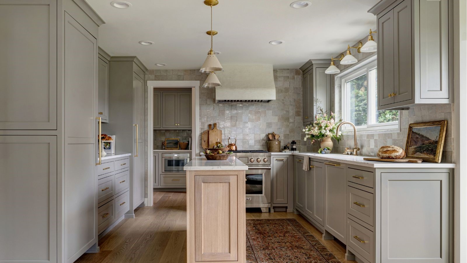
Most kitchens work best with three core tones: a dominant cabinet color, a supporting wall or surface color, and an accent finish through hardware, lighting, or furniture. This is commonly known as the 60-30-10 color rule.
Natural materials such as wood and stone may introduce extra variation, but the palette should still feel cohesive overall.
A kitchen that commits to fewer colors and executes them well will always look better than one hedging its bets across five shades.
Should kitchen cabinets be lighter or darker than walls?
If you’re mulling over whether kitchen cabinets should be lighter or darker than the walls, the truth is both can work beautifully. Lighter cabinets can create softness and airiness, while darker cabinetry introduces depth and definition.
The key is making sure the undertones relate well to one another and that the level of contrast suits the size and natural light of the room.
Some designers also embrace color drenching, using the same shade across walls, trim, and cabinetry for a more immersive effect. It creates a seamless, art-forward envelope that allows the furniture and curated details to really sing.
What is the most timeless kitchen color scheme?
The most timeless color palettes are usually rooted in natural materials and warm, adaptable tones. White oak, walnut, limestone, marble, aged brass, warm whites, greige, sage, and dusty blues all tend to age gracefully because they connect easily to different architectural styles.
The warmth and richness of walnut and white oak both feel grounded, sophisticated, and enduring. Softer earthy colors also tend to outlast sharper trend shades because they feel calmer and easier to live with over time.
Are two-tone kitchens still in style?
Yes, but the mood has softened considerably. Instead of high-contrast combinations, the most elegant two-tone kitchens now lean into gentler pairings such as mushroom and cream, sage and oak, walnut and warm white, or navy with pale stone. The effect feels layered and architectural rather than sharply divided.
How do I test kitchen colors properly?
Always test large samples vertically in the actual kitchen, positioned next to countertops, flooring, splashbacks, and hardware. Color shifts dramatically throughout the day, particularly under evening artificial lighting, so tiny paint chips and digital renderings are rarely enough. Many designers begin with the countertop material first, allowing the undertones in the stone to guide the wider palette.
One of the favorite methods is painting colors onto 2-by-2-foot thin plastic boards that can easily be transported to the slab yard or jobsite.
Seeing the samples against the stone in natural light makes all the difference and allows you to understand how the tones truly interact.
The truth is, there is no universal color you should never paint your kitchen – everyone’s tastes, homes, and lifestyles are different. The real mistakes happen when colors fight the room’s light, architecture, and materials instead of bringing them together in perfect harmony.