A contrasting island helps anchor the cooking area in open-plan kitchens. The same color can behave very differently depending on the shape, size, and light of a room. A deep navy that feels elegant in a generous, south-facing kitchen may feel oppressive in a narrow galley. A crisp white that looks clean in a bright showroom may feel stark in a shaded room.
When assessing a kitchen layout, pay closest attention to:
- Natural light levels throughout the day
- Ceiling height and room proportions
- Sightlines into adjoining spaces
- How much visual contrast the room can comfortably handle
Small Kitchens
Painting walls, trim, and cabinetry the same color creates a calm, unified look.
Small kitchens usually benefit from a more continuous palette. This does not mean they must be white, but it does mean avoiding too many abrupt changes in color or material. When cabinets, walls, and backsplash tones sit close together, the eye moves around the room more easily and the space feels larger.
Designers are also increasingly embracing color drenching in smaller kitchens, using very similar tones across cabinetry, walls, and trim to blur visual boundaries and reduce contrast. Color drenching allows the walls, moldings, and cabinetry to read as a unified whole.
A small kitchen can still handle contrast, but it often works best through hardware, lighting, or darker flooring rather than sharply contrasting cabinets and walls. Pale upper cabinets or open shelving can also reduce visual weight, while darker lower cabinetry helps ground the room and gives the overall design more intention.
Dark Kitchens
Leaning into deep colors can make a dark kitchen feel sophisticated and enveloping.
It is tempting to paint a dark kitchen bright white in an attempt to make it feel lighter, but this can easily backfire.
In rooms with limited daylight, stark whites often feel cold or slightly lifeless because there is not enough natural light to soften and animate them throughout the day.
Warm undertones are your friend here – a white with yellow or pink in it will always outperform a cool gray-white in a north-facing kitchen.
Lighting matters enormously too. Layered ceiling lighting, under-cabinet illumination, and warm-toned pendants help create depth and prevent richer palettes from feeling heavy.
Material choices can also do some of the light-boosting work. Don’t underestimate the impact of a warm-toned stone or timber; sometimes the color you need isn’t on the cabinets at all.
Pale worktops, warm oak, aged brass, and textured natural materials can all help bounce warmth around the room without forcing a dark kitchen into feeling artificially bright.
Open-Plan Kitchens
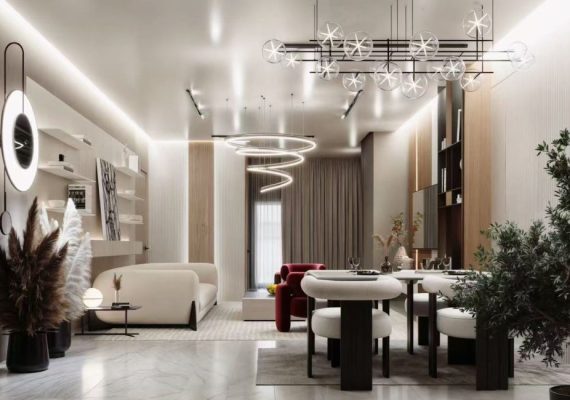
The colors used in this open-plan kitchen work both to zone the separate spaces and ensure they feel connected.
In an open-plan kitchen, the color scheme has to work from every angle. Cabinetry may be visible from the sofa, dining table, entryway, or patio, so it needs to feel integrated into the wider home rather than standing apart as a purely functional zone.
The most successful schemes usually rely on subtle repetition and material continuity. A metal finish repeated across lighting and hardware, cabinetry tones that relate to furniture elsewhere in the room, or colors pulled from artwork and textiles can all help the space feel more cohesive. Always want the kitchen and living areas to feel connected through a thoughtful tonal palette, not necessarily matching, but complementary in a way that feels layered and intentional.
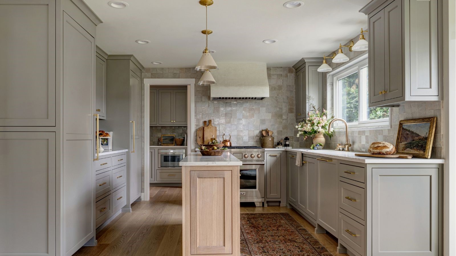
Texture also becomes increasingly important in larger open spaces, particularly when the cabinetry itself is relatively restrained. A vent hood wrapped in hand-burnished brass or finished in a soft hand-rubbed plaster instantly adds warmth and character.
Decorative lighting can also help anchor the kitchen visually within the wider room. Lighting over the island is often the jewelry of the room, pointing to sculptural pendants as a way to introduce personality without disrupting the overall palette.
Galley Kitchens vs Large Kitchens
Larger kitchens can carry high-contrast color pairings with far greater confidence than smaller spaces.
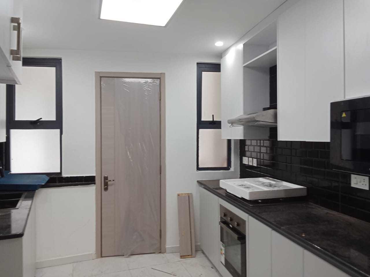
Galley kitchens and large kitchens require very different approaches to color because the proportions of the room change how contrast is perceived. In narrow galley layouts, strong opposing colors can exaggerate the sense of enclosure, while tonal cabinetry, reflective finishes, and lighter worktops help maintain a more open feeling.
Larger kitchens, however, often need stronger visual anchors to stop the room from feeling flat or underdefined. The bigger the space, the more contrast it can absorb.
Larger, open kitchens lean into saturated tones and to confidently mix multiple types of material to create focal points and visual movement.
This is where elements such as darker islands, richly veined stone, statement pantry cupboards, or deeper shades on tall cabinetry can help introduce rhythm and structure across a more expansive footprint.
Smaller kitchens generally benefit from a more restrained approach. That doesn’t mean you can’t use strong color and pattern, but the mix needs to be much more edited
Careful scaling is essential – materials and contrasts that feel balanced in a large kitchen can quickly dominate a compact galley space.
Modern vs Traditional Kitchens
Deep inky cabinetry feels especially at home against this kitchen’s classical moldings and architectural detailing.
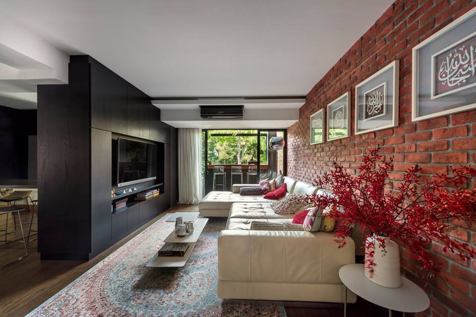
Architectural style has a huge influence on how color behaves in a kitchen. Modern kitchens often rely on minimalist palettes – warm whites, taupes, walnut, greige, and softer architectural neutrals – where the focus shifts toward materiality, proportion, and detailing rather than overt decoration.
Traditional kitchens, by contrast, can often accommodate more layered and expressive color choices. The proportions, moldings and textures are inherently warm and human in a way that gives me liberty to go in unique directions with color selections.
Rich greens, dusty blues, earthy browns, deep aubergines, and warmer creams all tend to sit naturally alongside framed cabinetry and classic hardware details.
The most successful schemes, however, avoid feeling too rigidly tied to one style direction. A contemporary kitchen in a period property can feel entirely appropriate when the palette relates to original flooring, timber tones, or surrounding architecture. Equally, more traditional cabinetry can feel fresher when paired with muddier, earthier, or slightly unexpected colors rather than predictable heritage creams.